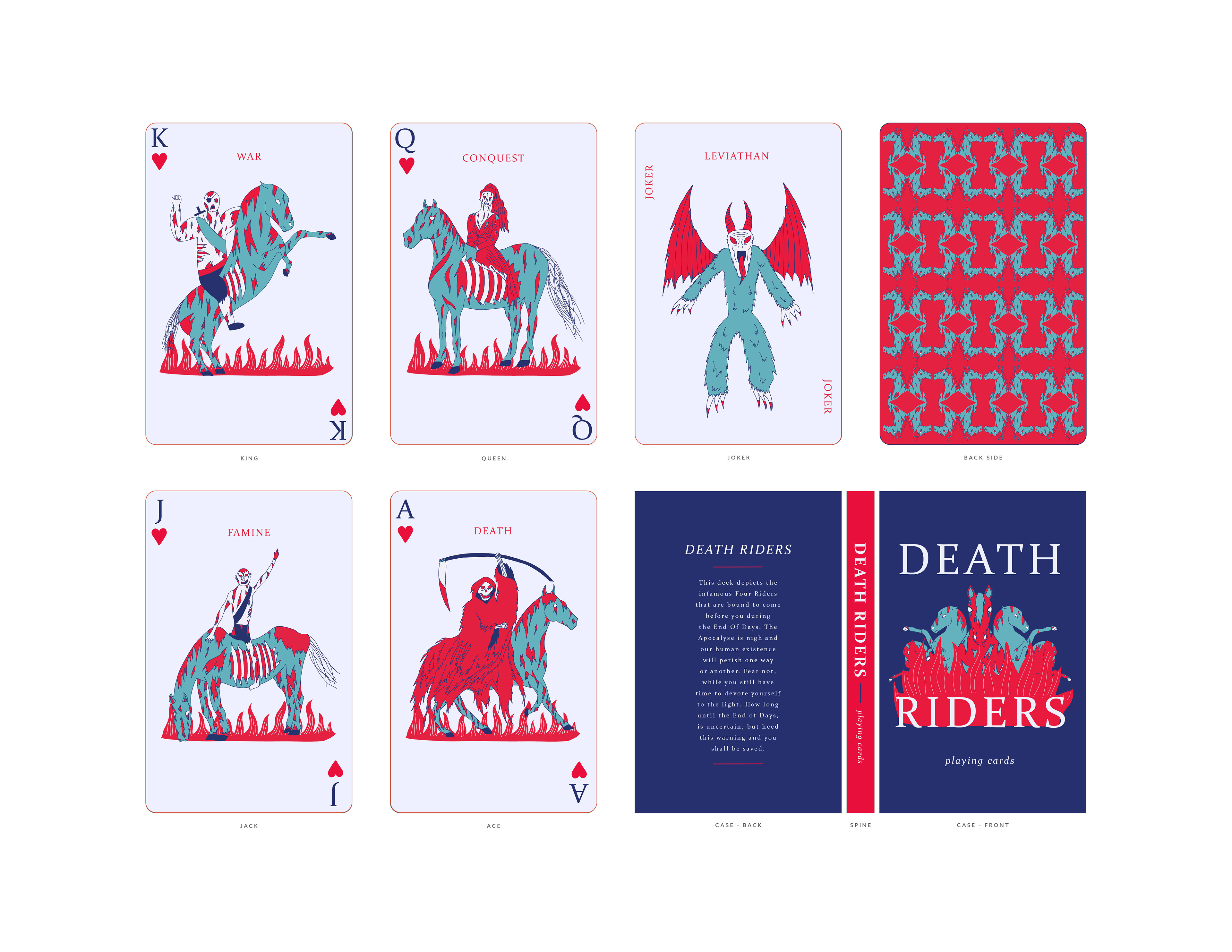
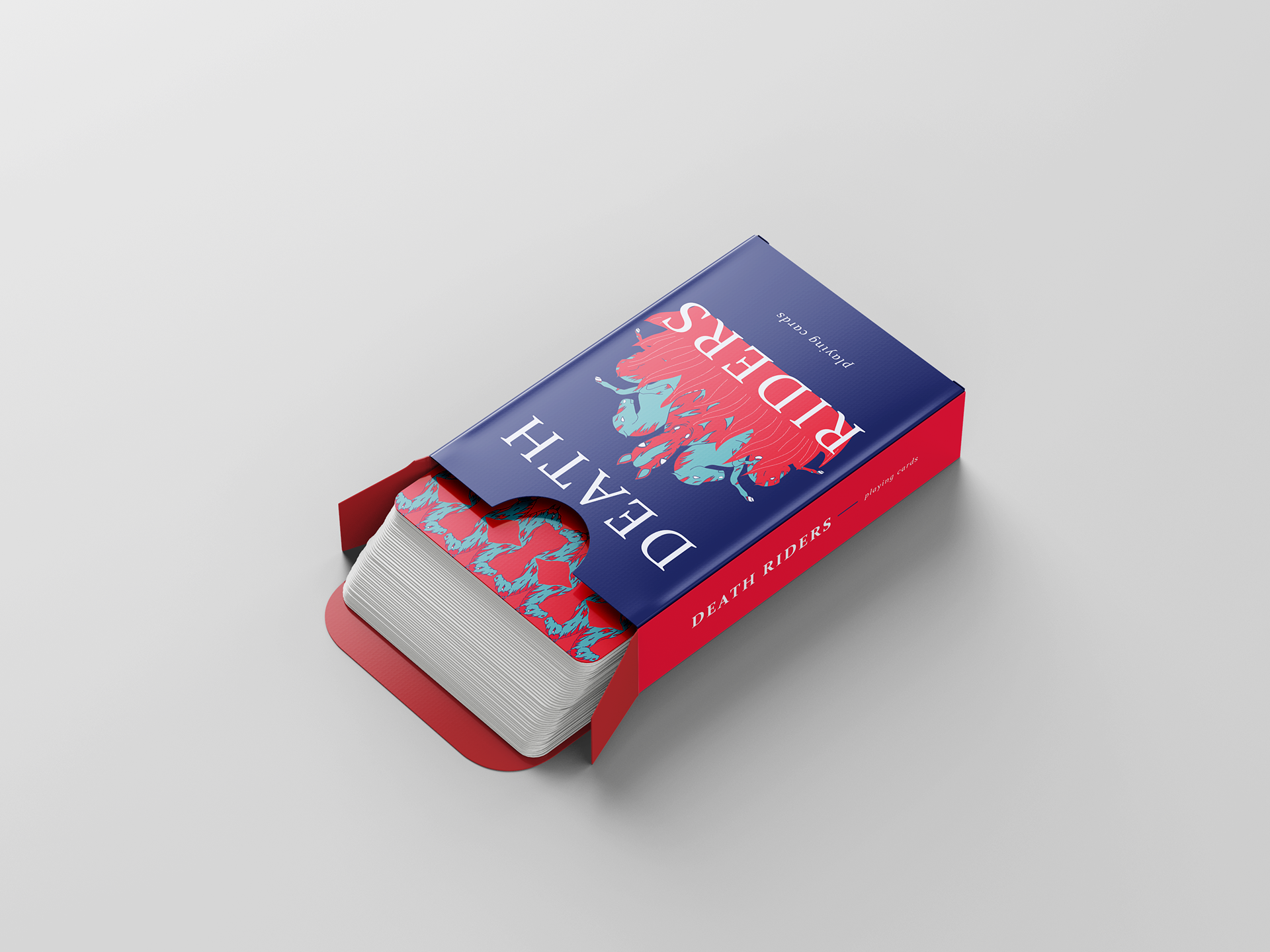
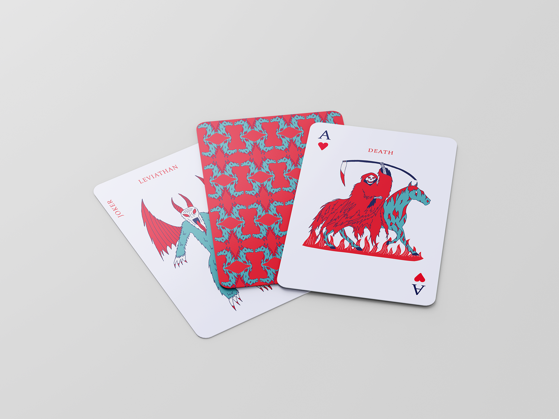
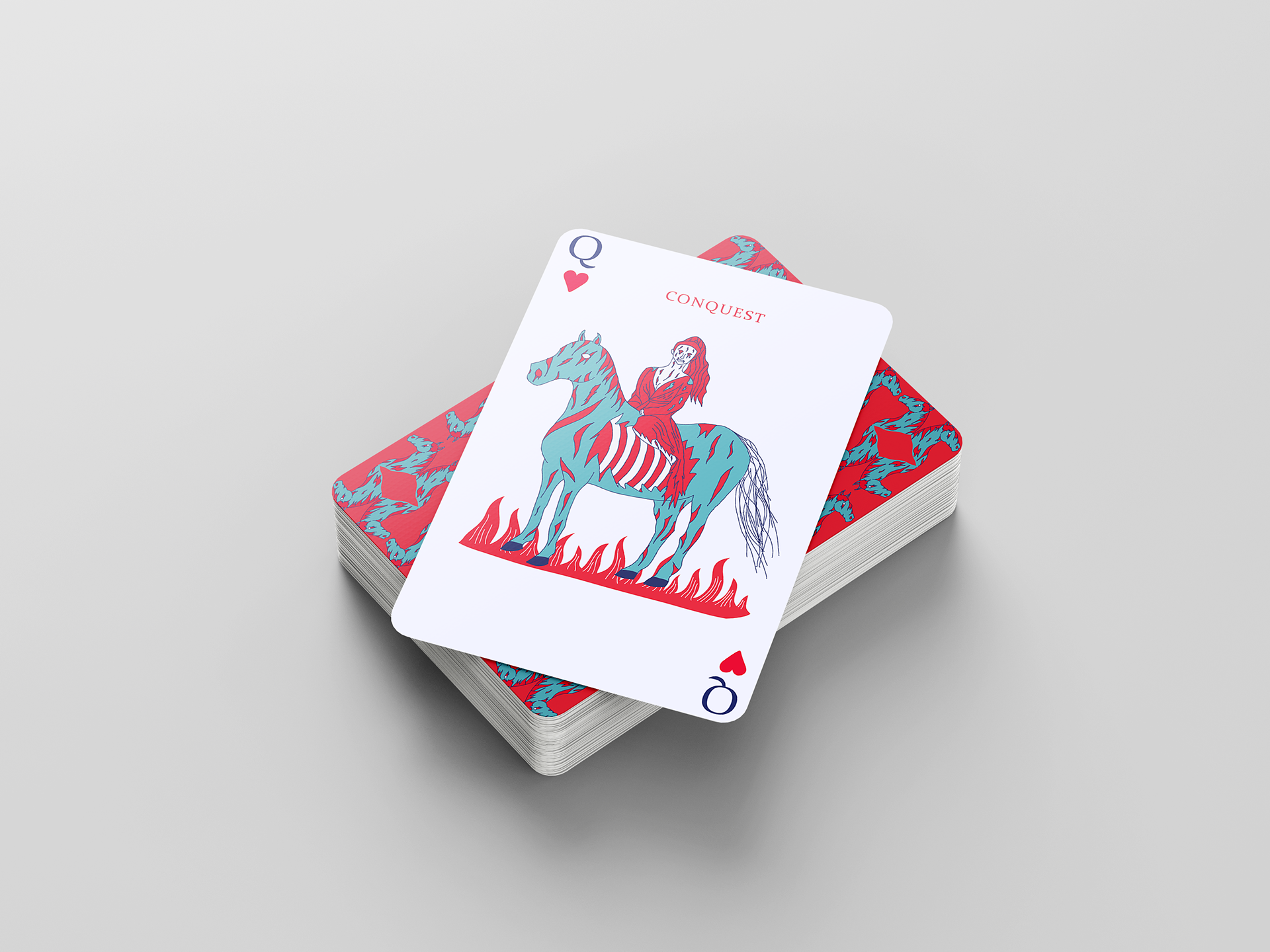
This was another branding project, but it was less intensive on the packaging and required more emphasis on the card graphics. I highly enjoyed this project because I had never heard of a deck of cards based on the "Four Horsemen," so I thought it would be a cool idea to explore. This was my first time working with a limited color palette, which I found to be challenging, but effective.